Descrição
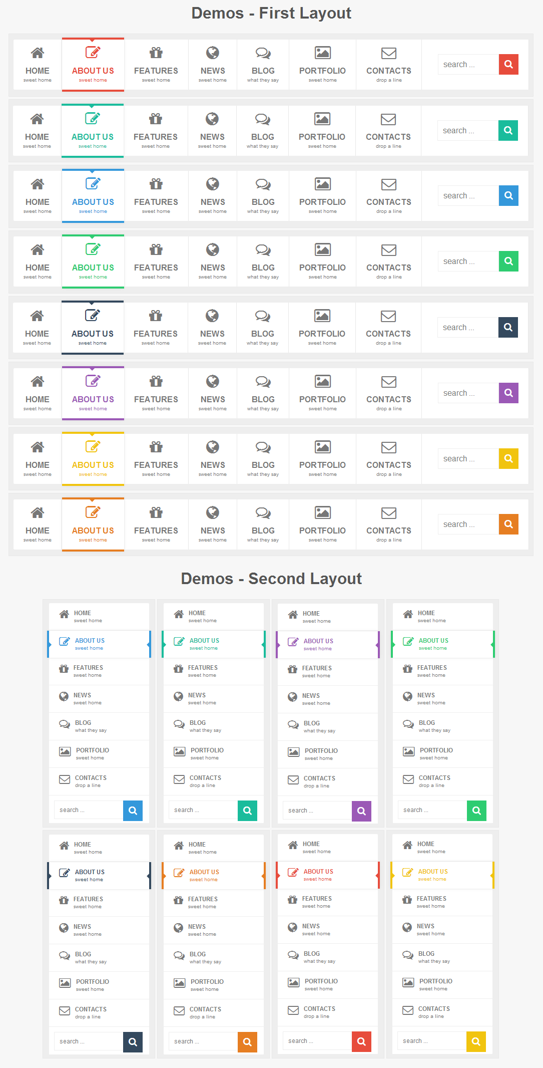
Puerto – Responsive Mega menu: is pure HTML5/CSS3 menu. Menu has HTML5 structure and works on all major browsers. Menu is easy to edit and integrate into any website. CSS is separate from HTML and is well commented. Menu has two similar layout and eight colors, each theme can be used separately without any connection with the others. Menu is responsible and adapts to the screen of the device(computer monitor, tablet, mobile phone…). Menu also has five different animation.
Menu works (the main structure is 100% same) on Internet Explorer 9, 8, 7… and a lot of old browsers but animation and some other CSS3 features do not work
-
Beautiful CSS3 Animations
There are a animation effects based on pure CSS3.
-
8 Color Schemes
Each color scheme has it’s own css file, that can be easily modified for creation your own colors.
-
Responsive Design
A fully responsive layout that adapts perfectly for all device resolutions like mobiles, tablets and desktops.
-
16 Useful Examples
You can use these examples as a base for creation your own navigations simple and fast.
-
HTML5 and CSS3
Take full advantage of modern web technologies. Semantic HTML markup and standards compliant CSS.
-
Cross-Browser
Tested on Windows (Chrome, Firefox, Opera, IE8, IE9, IE10), Mac (Safari, Chrome, Firefox, Opera), iOS (iPhone, iPad) and Android.
-
Unlimited Number of Levels
Menu has no limit for nested levels and all of them will be displayed correctly.
-
Commonly Used Forms
Includes search.
-
Documentation
Extensive step-by-step guide to help you with usage and customization.
-
Lifetime Support
To get support please send me an email through the contact form on my profile page.
Please don’t forget to follow me and to rate this awesome Mega menu 


