Descrição
Responsive CSS3 Flexbox Tables are truly responsive CSS3 tables based on flexbox model with expandable/ collapsible rows, column filtering, tooltips, and text wrapping control. Lightweight (no javascript, no icons or graphics), easy to configure and manage, contain many well-styled table cell components for various applications including buttons, status bars and check/ cross icons.
With Responsive CSS3 Flexbox Tables, you can build any table. You only need a few columns and rows, no extra options? Done! Or do you need to prepare a multicolumn table with drop-down (expandable) rows? No problem! You will do everything by editing a single HTML file.
All the functionalities presented in the live preview are an option – you do not need to use the expandable rows, column filtering or text-wrap toggle – just comment on the appropriate lines of code to create a table suited to your needs. Regardless of the number of rows or columns – your table will always display correctly on devices equipped with smaller screens.
 Latest Version: 11.06.2019 – v2.0. Check the changelog
Responsive CSS3 Flexbox Tables Core Features

Responsive Layout
CSS3 Flexbox Tables are fully responsive and adapts perfectly for any mobile device.
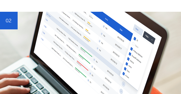
Column Filtering
The column filtering option allows you to hide selected columns for easier data comparison.
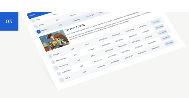
Expandable/ Collapsible Rows
You can make any table row expandable/ collapsible on a click. Expanding the row reveals the hidden content which can be based on a single or multi-column layout. Hidden content can also be a nested table.
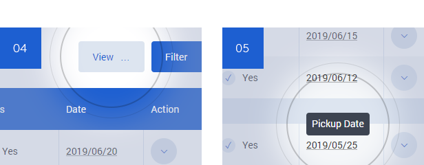
Text Wrapping Toggle / Tooltips
The tables comes with text wrapping control button with ability to wrap table text by default (not by the toggle). Table Cell Tooltips is another option. Use them both in the header and in the table content area.
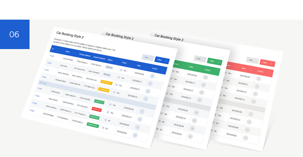
Color Schemes
You can use different color schemes to get a different look of the table.
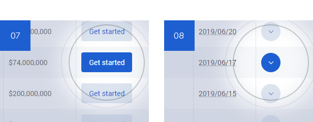
Button / Hidden Row Expand Button
Optional table elements include standard buttons and buttons that expand/ collapse hidden table rows.
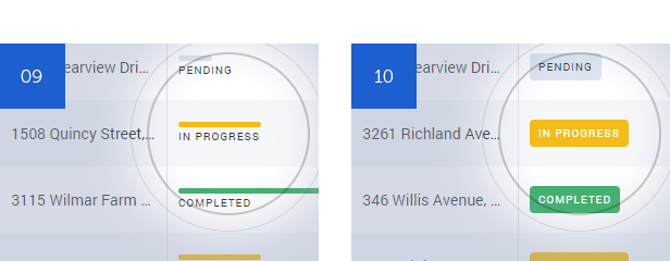
Status Bar / Status Label
The status bar or status label can be used to show the progress of a process, e.g. a reservation process.
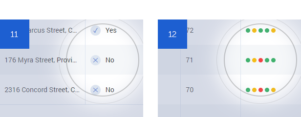
Check and Cross Icon / Team Form
Additional icons with check and cross symbols and component illustrating the sports form of the team – perfect for league table.
Extended Feature List
- Pure CSS3 Table
- No Javascript
- Screen Reader Compatibility
- Semantics Retained by ARIA
- Based on Flexbox Model
- Truly Responsive and Retina Ready
- Expandable/ Collapsible Rows
- Accordion Mode (Expandable/ Collapsible Headlines)
- Ability to Display Single or Multi-column Layout in Expandable/ Collapsible Section
- Ability to Display Nested Table in Expandable/ Collapsible Section
- Column Filtering for Easier Data Comparison
- Table Cell Tooltips
- Text Wrapping Toggle
- Ability to Wrap Table Text by Default (Not by the Toggle)
- Ability to Hide Text Wrapping and Column Filtering Buttons
- Ability to Expand Multiple Rows (Default Behavior)
- Ability to Expand Only One Row at a Time
- 3 Color Schemes
- 6 Pre-built Demo Tables
- Custom Table Cell Components:
- Button
- Hidden Row Expand Button
- Check/ Cross Icon
- Status Bar
- Status Label
- Tooltip
- Team Form (League Table)
- Ability to Force the Table Column to be Wider or Narrower (Depending on the Type of Data It Stores)
- Valid XHTML Code
- Crossbrowser Compatible
- Detailed Documentation
This Item is Supported
Support is conducted through our Support Forum. We’re in GMT +1 and we aim to answer all questions within 24 hours in weekdays. In some cases the waiting time can be extended to 48 hours. Support requests sent during weekends or public holidays will be processed on next Monday or the next business day.
We Are Trusted by 100,000+ Customers
We are a team of passionate people with 15+ years of experience and 10+ years of our presence on Envato Market. We specialize in WordPress, design, and development. Please follow us to stay up to date as we continue to craft our works.
This Product Has Been Featured On

Updates
11.06.2019 – v2.0
- Change the Name of the Item to ‘Responsive CSS3 Flexbox Tables’
- Completely Rebuilt HTML and CSS Code
- Removal of Any JS Scripts – It’s Super Lightweight Now
- The Whole Data Layer is Now in a Single HTML Document
- A New, Modern Look of the Tables in Line with Current Standards
- 3 Color Schemes
- 6 Pre-built Demo Tables
- Screen Reader Compatibility Implemented
- Semantics Retained by ARIA
- Based on Flexbox Model
- New Option to Wrap Text in a Table
- Table Cell Components for Various Applications Implemented
- Table Column Width Modifiers Implemented
- Support for Columns in Expandable/ Collapsible Section
- Support for Nested Table in Expandable/ Collapsible Section
- Accordion Option Implemented
- Subheaders Implemented
- Dropped Support for IE8
28.06.2012 – v1.0
- First Release

