Descrição
Table fluid – make your table responsive
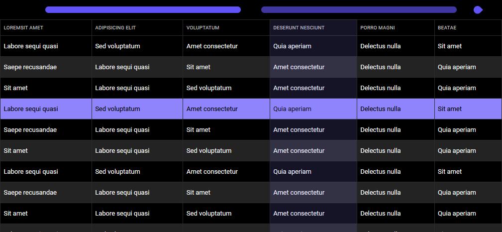
Special for non-technical users, just paste the html code and go.
This plugin contains:
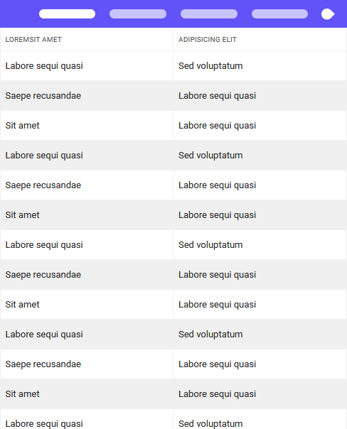
- fully responsive, pure css logic for display your table with all screen size devices with modern navigation,
- complete style for your table, with all functions you will need in future.
Display as many columns in the table as will fit on the screen,
you can switch between columns using very convenient navigation.
Within Table Fluid you can use our included style for table or any third party style for example Bootstrap, Bulma etc.
Responsive, complete HTML Table style for mobile devices and desctops
Fully modifiable, written in pure CSS with LESS and SASS compiler with many variables and mixing.
This plugin is part of Formir framework – first fully pure CSS framework.
Why I need Table fluid?
The correct layout of the table is one of the biggest problems faced by UX specialists,
it is very difficult to correctly present the data in the table, and at the same time to make it useful and cool.
We give you a ready solution, without additional implementation.
Slide beetwen columns using navigation – table fluid will display only number of columns will fill great
You can set up your breakpoints and columns number


Add hover style for a row, cell and even column

Manage your borders
Borders with 3 types, vertical, horizontal or none

Add expandable sections and rows
You can expand single row or whole-body sections

Add dots (…) and prevent text wrap
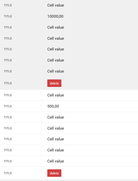
Don’t want to show the table as columns on mobile? use a mobile view with cell wrap as blocks
Add sticky header or footer in your table

Two-color themes included it’s very easy to modify own. Just use LESS or SASS compiler.
